T-Shirt Forums banner

Plastisol ink finish help

4.4K views 19 replies 7 participants last post by  JULUGO  
#1 ·
Hey, Having some trouble with the level of finish im getting and was wondering if anyone could help. I am new to screen printing and have tried water based inks and found that while they are easier to use the curing and final durability was an issue.

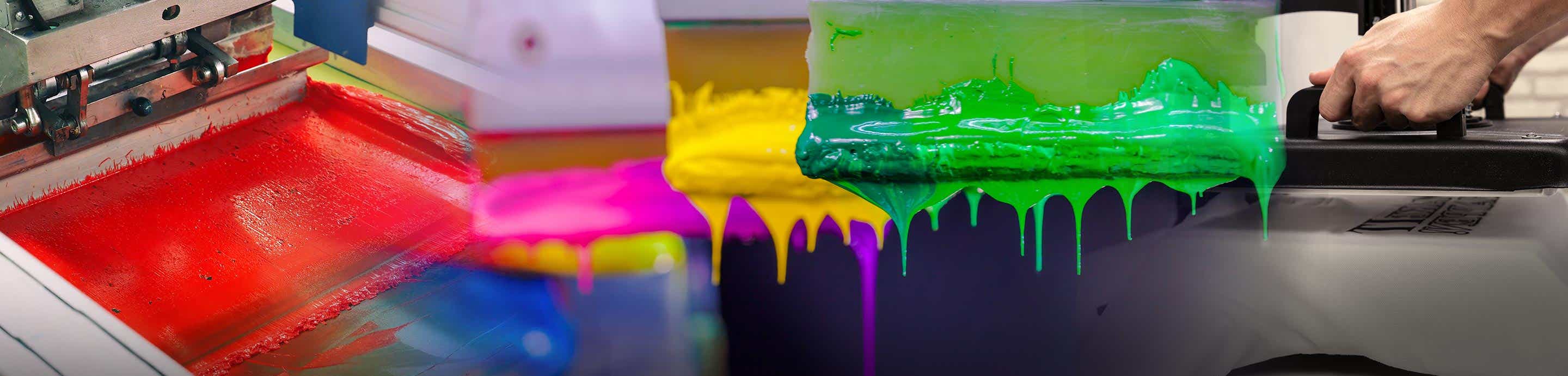
At first i could not get the thick white ink through my screen which is a 43t mesh, i had to buy some reducer to be able to use the ink and get it through the screen. I printed one of my designs and have been left with this finish.

Image


Image


i know i have not lined them up perfectly which was my bad, from a far it looks fine in my amateur opinion but up close as you can see its all "odd"

Image


this was my first time using the plastisol ink where i have been able to actually get a print because of using the reducer.

any advice on where im going wrong would be great.

Thanks
 
#2 ·
With white ink, it's thick by nature and you've got to mix mix mix and mix some more before use. And yes, adding a little bit of curable reducer is a good way to go.
The first picture, it looks like you've got a problem with how your screen came out, like you had some blowouts of the emulsion when rinsing after exposing.
Additionally, you need off contact, about two pennies thickness (screen adjusted above your substrate (shirt) as well as a tight screen. Try less angle in your stroke...try a push stroke and print/flash/print.
Keep at it. It takes some practice.
 
#3 ·
Hey Celtic,

Thanks for a great reply!, as i say i am new to this and feel plastisol is the way to go in terms of curing and durability.

I did that with no "off contact" as until i read into it after you post i was not even sure what it was so thanks again.

ive used the same screen with water based inks and hand no problems with the screen? but then the inks are worlds apart from each other.

the only pain at the mo is doing such short runs with plastisol ink , as in 2 or 3 shirts is the cleaning the screen out :(

Thanks again for the help
 
#4 ·
Hey guys

added an off contact bolt to my machine today and had a 1/4 off contact and ran a few t shirts through, i read up on some of the other threads and changed the angle i was pushing back, then first doing a fill stroke and then a push stroke. flashing and then repeating and was getting these results

Image


Image


i am noticing that the lettering of the web address is fatter when i do my second pass on the ink after flashing it. when i do my first print the letters are thinner and clearer then i flash it and print the second on it and they fattern out?

Image


any ideas what im doing wrong with this. It's not the end of the world but if its something im doing i can change would be good to try.

Thanks again
 
#5 ·
On the 2nd pass you can just do a fill stroke. No flood with ink in front of the squeegee make a stroke. This will help.

Dot gain will always be there. I set up all artwork with 30% dot gain in mind. That way your final print will look correct.
 
  • Like
Reactions: shatteredsoul
#7 ·
Did you purposely intend to have your letters look like that or is it part of the problem?

What brand of waterbased ink did you use?

I tried water base ink from Ryonet, and another supplier. I did not like it. Kept drying in the screen.

I switched back to plastisol. Plastisol is more forgiving.

Also, 1/4" is a little high on your off contact for t-shirts. It's okay with sweats. I'd lower to 1/8 of an inch.

I'd also do two wet strokes (print), flash, then print again. This method works great especially with darker t-shirts.
 
#8 ·
The font for the letters is all paint spaty and is ment to look like that sept not as fat as it is coming out. when i do my first hit and flash the letters are pretty thin and after the second hit they are fatter like in the picture.

im using Union ink and it is is diamond white Plastisol ink. i can change the off contact and give that ago i just tried 1/4 of an inch as a starter.

cool stuff, thanks
 
#12 ·
I wouldn't consider using a 43 unless it was an under base only. Grab a 110, the resolution on your lettering isnt very smooth.

Second, That textured look your getting - it (can be) because your squeegee angle is too high (straight up and down). Try laying the squeegee down to a 45 degree or lower and see the difference- the ink will lay down MUCH smoother.
 
#13 ·
I wouldn't consider using a 43 unless it was an under base only. Grab a 110, the resolution on your lettering isnt very .
Remember this is the World Wide Web. The 43t is the European equivalent to the 110 in the US. That is 43 threads per CM. times that by 2.54 to get the Mesh in inches.
 
  • Like
Reactions: schema
#18 · (Edited)
When pulling or pushing the higher the angle the more ink you will leave. The lower the angle the less the ink left. When doing a P/F/P I will do a stoke with the squeegee tilted back toward me so that just a little ink is left then flash and do a stoke with the squeegee at about 80 degrees. You can reverse the method if your getting rough print but I find there is less dot gain this way.